Here we illustrate how we can use Gaussian Process modeling to interpolate missing data and forecast time series. The basic idea is to first model the power spectral density of the observed data (learn from the data), and then by use the model, conditioned on the observed data, to fill the gaps (interpolate) and forecast unknown values.
We show how this works by first simulating a continuous light curve, and then introduce some gaps and then do the interpolation and forecasting.
Let’s import the libraries we need and set some properties of the plots for clarity
import numpy as np
import aztools as az
import fqlag
import matplotlib.pyplot as plt

# change some settings in the plot to make them clear
plt.rcParams.update({
    'font.size': 16,
    'font.family': 'monospace'
})
We now simulate a light curve. We follow the steps presented in details in the simulations post, which contains details of the parameters used for the simulation.
In short, we are simulating a light curve of length n, a mean mu, assuming the power density spectrum has a bending power-law shape, with parameters params. We then add observational Gaussian noise that is 10% of the mean. These represent the raw data set: tarr_raw, rarr_raw and rerr_raw. The latter is the observational error.
# input parameters
seed = 239
np.random.seed(3322)
n = 256
params = [4e-4, -1, -2, 5e-2]
mu = 100
dt = 1.0

# simulation
sim = az.SimLC(seed=seed)
sim.add_model('broken_powerlaw', params)
sim.simulate(n*3, dt, mu, 'rms')
tarr_raw, rarr_raw = sim.t[:n], sim.x[:n]
rarr_raw = np.random.randn(n)*10 + rarr_raw
rerr_raw = rarr_raw*0 + 10
The next step is to add some gaps. The following produces semi-periodic gaps.
The new data arrays are: tarr, rarr and rerr
# add some gaps #
idx = np.arange(len(tarr_raw))
prob = np.cos(0.03*idx)**2
idxGap = np.sort(np.random.choice(idx, np.int(len(idx)/3), replace=False, p = prob/prob.sum()))
rarr = rarr_raw[idxGap]
rerr = rerr_raw[idxGap]
tarr = tarr_raw[idxGap]
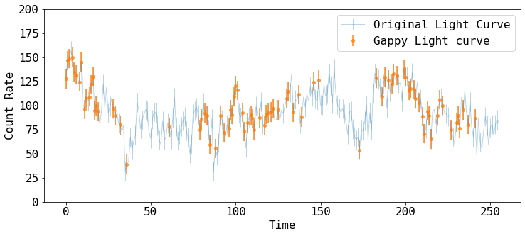
Let’s plot the both the raw and gappy datasets
fig = plt.figure(figsize=(12,5))
plt.errorbar(tarr_raw, rarr_raw, rerr_raw, fmt='-', ms=4, lw=1, alpha=0.3,
    label='Original Light Curve')
plt.errorbar(tarr, rarr, rerr, fmt='o', ms=4, lw=2, alpha=0.7,
    label='Gappy Light curve')

plt.xlabel('Time')
plt.ylabel('Count Rate')
plt.ylim([0, 200])
plt.legend()
Modeling the Power Spectral Density
The next step is to model the power spectral density (PSD). fqlag allow for this to be modeled using a functional form, or as a piecewise funciton. See fqlag for details.
Here, the observed light curve is modeled with a bending power-law function.
First, we define the low and high frequency limits available in the data, and set the fitting frequency range to be slightly larger than that.
Then, we initialize psdMod as a fqlag.Psdf object, giving the observed data as input, and selecting model='bpl' for bending power-law.
We then calculate the log-likelihood value for some input parameter values to check that everything works. The input parameters in this case are: [log_normlaization, index, log_frequency_break]. See fqlag for details.
# frequency bins
fmin = 1./(tarr[-1] - tarr[0])
fmax = 0.5/np.min(tarr[1:] - tarr[:-1])
fqBins = np.array([0.1*fmin, 2*fmax])

# initlize the model
psdMod = fqlag.Psdf(tarr, rarr, rerr, fqBins, model='bpl')

# starting model prameters before doing the likelihood maximization
inPars = np.array([-4., -2., -3])
logLike = psdMod.loglikelihood(inPars)
print('The log-likelihood for the starting parameters is:', logLike)
The log-likelihood for the starting parameters is: -384.9716303489447
Now, we run the optimization routine to find the model parameters that maximize the likelihood.
The returned parameters are:
psd: model parameterspsdErr: The estimated uncertaintiy in the model parameters.psdFit: The optimization object return byscipy.optimize.minimize
Note: This may be slow for very long light curves
psd, psdErr, psdFit = fqlag.misc.maximize(psdMod, inPars)
-379.917 -3.43 -3.12 -2.65 1.14e-05
** done **
Interpolation and Forecasting
Given the obtained best-fit model parameters, we do the interpolation and forecasting conditioned on the observed data.
We create a new time axis, tNew, the contains the times where we need to the estimation to be done.
Here, we do the prediction over the gaps, and also in several points in the future.
We call psdMod.conditional_predict to do the calculation, which takes as input the new time array, and the input parameters used to construct psdMod.
It additional takes an optional sample argument, which if given, it is the number new light curves to be randomly-sampled assuming the model covariance, again conditioned on the data.
The function returns yNew and yNewe, which are the best estimate of the light curve at tNew and their uncertainties, respectively.
samples is also returned if sample is not None.
Let’s focus on yNew and yNewe first,
# prediction & forecasting
tNew = np.arange(270)
yNew,yNewe,samples = psdMod.conditional_predict(psd, tNew, {'fql':fqBins, 'model':'bpl'}, sample=20)
Let’s plot these estimates and compare them to the raw light curve we started with
fig = plt.figure(figsize=(12,5))
plt.errorbar(tarr_raw, rarr_raw, rerr_raw, fmt='-', ms=4, lw=1, alpha=0.3,
    label='Original Light Curve')
plt.errorbar(tarr, rarr, rerr, fmt='o', ms=4, lw=2, alpha=0.7,
    label='Gappy Light Curve')
plt.fill_between(tNew, yNew-yNewe, yNew+yNewe, alpha=0.2, color='C2',
    label='Model Prediction')
plt.plot(tNew, yNew, lw=1, color='C2')


plt.xlabel('Time')
plt.ylabel('Count Rate')
plt.ylim([0, 240])
plt.legend()
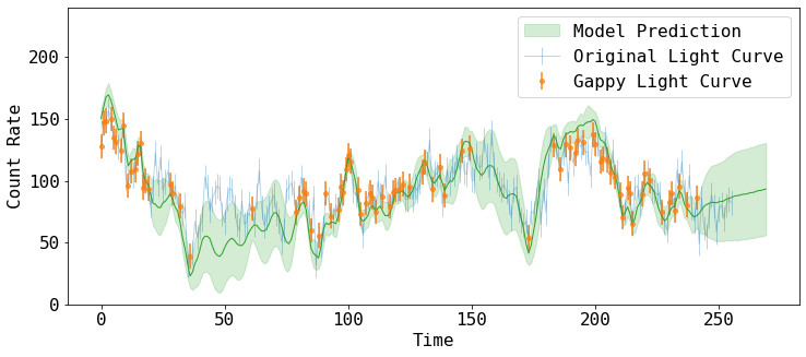
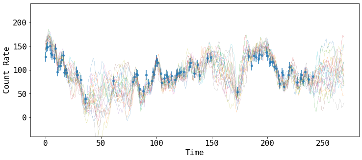
yNew and yNewe can be interpreted as the mean and standard deviation of the many samples that the model predict to fill the gaps.
We can show how some of those prediciton look like, by drawing samples of the model covariance, conditioned on the data.
samples contain a list of such random variates.
fig = plt.figure(figsize=(12,5))
plt.errorbar(tarr, rarr, rerr, fmt='o', ms=4, lw=2, alpha=0.7, label='Gappy Light Curve')
for x in samples:
    plt.plot(tNew, x, '-', lw=0.2)


plt.xlabel('Time')
plt.ylabel('Count Rate')
plt.ylim([-40, 240])